Data In, Decision Out

This recent blog post by Seth Godin made me think about the data quality adage garbage in, garbage out (aka GIGO).

Since we live in the era of data deluge and information overload, Godin’s question about how much time and effort should be spent on absorbing data and how much time and effort should be invested in producing output is an important one, especially for enterprise data management, where it boils down to how much data should be taken in before a business decision can come out.

In other words, it’s about how much time and effort is invested in the organization’s data in, decision out (i.e., DIDO) process.

And, of course, quality is an important aspect of the DIDO process—both data quality and decision quality.  But, oftentimes, it is an organization’s overwhelming concerns about its GIGO that lead to inefficiencies and ineffectiveness around its DIDO.

How much data is necessary to make an effective business decision?  Having complete (i.e., all available) data seems obviously preferable to incomplete data.  However, with data volumes always burgeoning, the unavoidable fact is that sometimes having more data only adds confusion instead of clarity, thereby becoming a distraction instead of helping you make a better decision.

Although accurate data is obviously preferable to inaccurate data, less than perfect data quality can not be used as an excuse to delay making a business decision.  Even large amounts of high quality data will not guarantee high quality business decisions, just as high quality business decisions will not guarantee high quality business results.

In other words, overcoming GIGO will not guarantee DIDO success.

When it comes to the amount and quality of the data used to make business decisions, you can’t always get the data you want, and while you should always be data-driven, never only intuition-driven, eventually it has to become: Time to start deciding.


Related Posts

The Data-Decision Symphony

The Real Data Value is Business Insight

Is your data complete and accurate, but useless to your business?

DQ-View: From Data to Decision

TDWI World Conference Orlando 2010

The Asymptote of Data Quality

In analytic geometry (according to Wikipedia), an asymptote of a curve is a line such that the distance between the curve and the line approaches zero as they tend to infinity.  The inspiration for my hand-drawn illustration was a similar one (not related to data quality) in the excellent book Linchpin: Are You Indispensable? by Seth Godin, which describes an asymptote as:

“A line that gets closer and closer and closer to perfection, but never quite touches.”

“As you get closer to perfection,” Godin explains, “it gets more and more difficult to improve, and the market values the improvements a little bit less.  Increasing your free-throw percentage from 98 to 99 percent may rank you better in the record books, but it won’t win any more games, and the last 1 percent takes almost as long to achieve as the first 98 percent did.”

The pursuit of data perfection is a common debate in data quality circles, where it is usually known by the motto:

“The data will always be entered right, the first time, every time.”

However, Henrik Liliendahl Sørensen has cautioned that even when this ideal can be achieved, we must still acknowledge the inconvenient truth that things change, and Evan Levy has reminded us that data quality isn’t the same as data perfection, and David Loshin has used the Pareto principle to describe the point of diminishing returns in data quality improvements.

Chasing data perfection can be a powerful motivation, but it can also undermine the best of intentions.  Not only is it important to accept that the Asymptote of Data Quality can never be reached, but we must realize that data perfection was never the goal.

The goal is data-driven solutions for business problems—and these dynamic problems rarely have (or require) a perfect solution.

Data quality practitioners must strive for continuous data quality improvement, but always within the business context of data, and without losing themselves in the pursuit of a data-myopic ideal such as data perfection.


Related Posts

To Our Data Perfectionists

The Data-Decision Symphony

Is your data complete and accurate, but useless to your business?

Finding Data Quality

MacGyver: Data Governance and Duct Tape

You Can’t Always Get the Data You Want

What going to the dentist taught me about data quality

A Tale of Two Q’s

Data Quality and The Middle Way

Hyperactive Data Quality (Second Edition)

Missed It By That Much

The Data Quality Goldilocks Zone

#FollowFriday Spotlight: @hlsdk

FollowFriday Spotlight is an OCDQ regular segment highlighting someone you should follow—and not just Fridays on Twitter.

Henrik Liliendahl Sørensen is a data quality and master data management (MDM) professional with over 30 years of experience in the information technology (IT) business working within a large range of business areas, such as government, insurance, manufacturing, membership, healthcare, and public transportation.

For more details about what Henrik has been, and is, working on, check out his My Been Done List and 2011 To Do List.

Henrik is also a charter member of the IAIDQ, and the creator of the LinkedIn Group for Data Matching for people interested in data quality and thrilled by automated data matching, deduplication, and identity resolution.

Henrik is one of the most prolific and popular data quality bloggers, regularly sharing his excellent insights about data quality, data matching, MDM, data architecture, data governance, diversity in data quality, and many other data management topics.

So check out Liliendahl on Data Quality for great blog posts written by Henrik Liliendahl Sørensen, such as these popular posts:


Related Posts

Delivering Data Happiness

#FollowFriday Spotlight: @DataQualityPro

#FollowFriday and Re-Tweet-Worthiness

#FollowFriday and The Three Tweets

Dilbert, Data Quality, Rabbits, and #FollowFriday

Twitter, Meaningful Conversations, and #FollowFriday

The Fellowship of #FollowFriday

Social Karma (Part 7) – Twitter

#FollowFriday Spotlight: @DataQualityPro

FollowFriday Spotlight is an OCDQ regular segment highlighting someone you should follow—and not just Fridays on Twitter.

Links for Data Quality Pro and Dylan Jones:

Data Quality Pro, founded and maintained by Dylan Jones, is a free and independent community resource dedicated to helping data quality professionals take their career or business to the next level.  Data Quality Pro is your free expert resource providing data quality articles, webinars, forums and tutorials from the world’s leading experts, every day.

With the mission to create the most beneficial data quality resource that is freely available to members around the world, the goal of Data Quality Pro is “winning-by-sharing” and they believe that by contributing a small amount of their experience, skill or time to support other members then truly great things can be achieved.

Membership is 100% free and provides a broad range of additional content for professionals of all backgrounds and skill levels.

Check out the Best of Data Quality Pro, which includes the following great blog posts written by Dylan Jones in 2010:


Related Posts

#FollowFriday and Re-Tweet-Worthiness

#FollowFriday and The Three Tweets

Dilbert, Data Quality, Rabbits, and #FollowFriday

Twitter, Meaningful Conversations, and #FollowFriday

The Fellowship of #FollowFriday

Social Karma (Part 7) – Twitter

The Best Data Quality Blog Posts of 2010

This year-end review provides summaries of and links to The Best Data Quality Blog Posts of 2010.  Please note the following:

  • For simplicity, “Data Quality” also includes Data Governance, Master Data Management, and Business Intelligence
  • Intentionally excluded from consideration were my best blog posts of the year — not counting that shameless plug :-)
  • The Data Roundtable was also excluded since I already published a series about its best 2010 blog posts (see links below)
  • Selection was based on a pseudo-scientific, quasi-statistical, and proprietary algorithm (i.e., I just picked the ones I liked)
  • Ordering is based on a pseudo-scientific, quasi-statistical, and proprietary algorithm (i.e., no particular order whatsoever)


The Best Data Quality Blog Posts of 2010

  • Data Quality is a DATA issue by Graham Rhind – Expounds on the common discussion about whether data quality is a business issue or a technical issue by explaining that although it can sometimes be either or both, it’s always a data issue.
  • Bad word?: Data Owner by Henrik Liliendahl Sørensen – Examines how the common data quality terms “data owner” and “data ownership” are used, whether they are truly useful, and generated an excellent comment discussion about ownership.
  • Predictably Poor MetaData Quality by Beth Breidenbach – Examines whether data quality and metadata quality issues stem from the same root source—human behavior, which is also the solution to these issues since technology doesn’t cause or solve these challenges, but rather, it’s a tool that exacerbates or aids human behavior in either direction.
  • WANTED: Data Quality Change Agents by Dylan Jones – Explains the key traits required of all data quality change agents, including a positive attitude, a willingness to ask questions, innovation advocating, and persuasive evangelism.
  • Profound Profiling by Daragh O Brien – Discusses the profound business benefits of data profiling for organizations seeking to manage risk and ensure compliance, including the sage data and information quality advice: “Profile early, profile often.”
  • The Importance of Scope in Data Quality Efforts by Jill Dyché – Illustrates five levels of delivery that can help you quickly establish the boundaries of your initial data quality project, which will enable you to implement an incremental approach for your sustained data quality program that will build momentum to larger success over time.
  • The Myth about a Myth by Henrik Liliendahl Sørensen – Debunks the myth that data quality (and a lot of other things) is all about technology — and it’s certainly no myth that this blog post generated a lengthy discussion in the comments section.
  • Definition drift by Graham Rhind – Examines the persistent problems facing attempts to define a consistent terminology within the data quality industry for concepts such as validity versus accuracy, and currency versus timeliness.
  • Data Quality: A Philosophical Approach to Truth by Beth Breidenbach – Examines how the background, history, and perceptions we bring to a situation, any situation, will impact what we perceive as “truth” in that moment, and we don’t have to agree with another’s point of view, but we should at least make an attempt to understand the logic behind it.
  • What Are Master Data? by Marty Moseley of IBM Initiate – Defines the differences between reference data and master data, providing examples of each, and, not surprisingly, this blog post also sparked an excellent discussion within its comments.
  • Data Governance Remains Immature by Rob Karel – Examines the results of several data governance surveys and explains how there is a growing recognition that data governance is not — and should never have been — about the data.
  • The Future – Agile Data-Driven Enterprises by John Schmidt on Informatica Perspectives – Concludes a seven-part series about data as an asset, which examines how successful organizations manage their data as a strategic asset, ensuring that relevant, trusted data can be delivered quickly when, where and how needed to support the changing needs of the business.
  • Data as an Asset by David Pratt – The one where a new guy in the data blogosphere (his blog launched in November 2010) explains treating data as an asset is all about actively doing things to improve both the quality and usefulness of the data.


PLEASE NOTE: No offense is intended to any of the great 2010 data quality blog posts not listed above.  However, if you feel that I have made a glaring omission, then please feel free to post a comment below and add it to the list.  Thanks!

I hope that everyone had a great 2010 and I look forward to seeing all of you around the data quality blogosphere in 2011.


Related Posts

The 2010 Data Quality Blogging All-Stars

Recently Read: May 15, 2010

Recently Read: March 22, 2010

Recently Read: March 6, 2010

Recently Read: January 23, 2010


Additional Resources

From the IAIDQ, read the 2010 issues of the Blog Carnival for Information/Data Quality:

From the Data Roundtable, read the 2010 quarterly review blog series:

I’m Gonna Data Profile (500 Records)

While researching my blog post (to be published on December 31) about the best data quality blog posts of the year, I re-read the great post Profound Profiling by Daragh O Brien, which recounted how he found data profiling cropping up in conversations and presentations he’d made this year, even where the topic of the day wasn’t “Information Quality” and shared his thoughts on the profound business benefits of data profiling for organizations seeking to manage risk and ensure compliance.

And I noticed that I had actually commented on this blog post . . . with song lyrics . . .


I’m Gonna Data Profile (500 Records) *

When I wake up, well I know I’m gonna be,
I’m gonna be the one who profiles early and often for you
When I go out, yeah I know I’m gonna be
I’m gonna be the one who goes along with data
If I get drunk, well I know I’m gonna be
I’m gonna be the one who gets drunk on managing risk for you
And if I haver up, yeah I know I’m gonna be
I’m gonna be the one who’s havering about how: “It’s the Information, Stupid!”

But I would profile 500 records
And I would profile 500 more
Just to be the one who profiles a thousand records
To deliver the profound business benefits of data profiling to your door

da da da da – ta ta ta ta
da da da da – ta ta ta ta – data!
da da da da – ta ta ta ta
da da da da – ta ta ta ta – data profiling!

When I’m working, yes I know I’m gonna be
I’m gonna be the one who’s working hard to ensure compliance for you
And when the money, comes in for the work I do
I’ll pass almost every penny on to improving data for you
When I come home (When I come home), well I know I’m gonna be
I’m gonna be the one who comes back home with data quality
And if I grow-old, (When I grow-old) well I know I’m gonna be
I’m gonna be the one who’s growing old with information quality

But I would profile 500 records
And I would profile 500 more
Just to be the one who profiles a thousand records
To deliver the profound business benefits of data profiling to your door

da da da da – ta ta ta ta
da da da da – ta ta ta ta – data!
da da da da – ta ta ta ta
da da da da – ta ta ta ta – data profiling!

When I’m lonely, well I know I’m gonna be
I’m gonna be the one who’s lonely without data profiling to do
And when I’m dreaming, well I know I’m gonna dream
I’m gonna dream about the time when I’m data profiling for you
When I go out (When I go out), well I know I’m gonna be
I’m gonna be the one who goes along with data
And when I come home (When I come home), yes I know I’m gonna be
I’m gonna be the one who comes back home with data quality
I’m gonna be the one who’s coming home with information quality

But I would profile 500 records
And I would profile 500 more
Just to be the one who profiles a thousand records
To deliver the profound business benefits of data profiling to your door

da da da da – ta ta ta ta
da da da da – ta ta ta ta – data!
da da da da – ta ta ta ta
da da da da – ta ta ta ta – data profiling!

___________________________________________________________________________________________________________________

* Based on the 1988 song I’m Gonna Be (500 Miles) by The Proclaimers.


Data Quality Music (DQ-Songs)

Over the Data Governance Rainbow

A Record Named Duplicate

New Time Human Business

People

You Can’t Always Get the Data You Want

A spoonful of sugar helps the number of data defects go down

Data Quality is such a Rush

I’m Bringing DQ Sexy Back

Imagining the Future of Data Quality

The Very Model of a Modern DQ General

Commendable Comments (Part 8)

This Thursday is Thanksgiving Day, which is a United States holiday with a long and varied history.  The most consistent themes remain family and friends gathering together to share a large meal and express their gratitude.

This is the eighth entry in my ongoing series for expressing my gratitude to my readers for their truly commendable comments on my blog posts.  Receiving comments is the most rewarding aspect of my blogging experience.  Although I am truly grateful to all of my readers, I am most grateful to my commenting readers.


Commendable Comments

On The Data-Decision Symphony, James Standen commented:

“Being a lover of both music and data, it struck all the right notes!

I think the analogy is a very good one—when I think about data as music, I think about a companies business intelligence architecture as being a bit like a very good concert hall, stage, and instruments. All very lovely to listen to music—but without the score itself (the data), there is nothing to play.

And while certainly a real live concert hall is fantastic for enjoying Bach, I’m enjoying some Bach right now on my laptop—and the MUSIC is really the key.

Companies very often focus on building fantastic concert halls (made with all the best and biggest data warehouse appliances, ETL servers, web servers, visualization tools, portals, etc.) but forget that the point was to make that decision—and base it on data from the real world. Focusing on the quality of your data, and on the decision at hand, can often let you make wonderful music—and if your budget or schedule doesn't allow for a concert hall, you might be able to get there regardless.”

On “Some is not a number and soon is not a time”, Dylan Jones commented:

“I used to get incredibly frustrated with the data denial aspect of our profession.  Having delivered countless data quality assessments, I’ve never found an organization that did not have pockets of extremely poor data quality, but as you say, at the outset, no-one wants to believe this.

Like you, I’ve seen the natural defense mechanisms.  Some managers do fear the fallout and I’ve even had quite senior directors bury our research and quickly cut any further activity when issues have been discovered, fortunately that was an isolated case.

In the majority of cases though I think that many senior figures are genuinely shocked when they see their data quality assessments for the first time.  I think the big problem is that because they institutionalize so many scrap and rework processes and people that are common to every organization, the majority of issues are actually hidden.

This is one of the issues I have with the big shock announcements we often see in conference presentations (I’m as guilty as hell for these so call me a hypocrite) where one single error wipes millions off a share price or sends a space craft hurtling into Mars. 

Most managers don’t experience this cataclysm, so it’s hard for them to relate to because it implies their data needs to be perfect, they believe that’s unattainable and lose interest.

Far better to use anecdotes like the one cited in this blog to demonstrate how simple improvements can change lives and the bottom line in a limited time span.”

On The Real Data Value is Business Insight, Winston Chen commented:

“Yes, quality is in the eye of the beholder.  Data quality metrics must be calculated within the context of a data consumer.  This context is missing in most software tools on the market.

Another important metric is what I call the Materiality Metric.

In your example, 50% of customer data is inaccurate.  It’d be helpful if we know which 50%.  Are they the customers that generate the most revenue and profits, or are they dormant customers?  Are they test records that were never purged from the system?  We can calculate the materiality metric by aggregating a relevant business metric for those bad records.

For example, 85% of the year-to-date revenue is associated with those 50% bad customer records.

Now we know this is serious!”

On The Real Data Value is Business Insight, James Taylor commented:

“I am constantly amazed at the number of folks I meet who are paralyzed about advanced analytics, saying that ‘we have to fix/clean/integrate all our data before we can do that.’

They don’t know if the data would even be relevant, haven’t considered getting the data from an external source and haven't checked to see if the analytic techniques being considered could handle the bad or incomplete data automatically!  Lots of techniques used in data mining were invented when data was hard to come by and very ‘dirty’ so they are actually pretty good at coping.  Unless someone thinks about the decision you want to improve, and the analytics they will need to do so, I don’t see how they can say their data is too dirty, too inconsistent to be used.”

On The Business versus IT—Tear down this wall!, Scott Andrews commented:

“Early in my career, I answered a typical job interview question ‘What are your strengths?’ with:

‘I can bring Business and IT together to deliver results.’

My interviewer wryly poo-poo’d my answer with ‘Business and IT work together well already,’ insinuating that such barriers may have existed in the past, but were now long gone.  I didn’t get that particular job, but in the years since I have seen this barrier in action (I can attest that my interviewer was wrong).

What is required for Business Intelligence success is to have smart business people and smart IT people working together collaboratively.  Too many times one side or the other says ‘that’s not my job’ and enormous potential is left unrealized.”

On The Business versus IT—Tear down this wall!, Jill Wanless commented:

“It amazes me (ok, not really...it makes me cynical and want to rant...) how often Business and IT SAY they are collaborating, but it’s obvious they have varying views and perspectives on what collaboration is and what the expected outcomes should be.  Business may think collaboration means working together for a solution, IT may think it means IT does the dirty work so Business doesn’t have to.

Either way, why don’t they just start the whole process by having a (honest and open) chat about expectations and that INCLUDES what collaboration means and how they will work together.

And hopefully, (here’s where I start to rant because OMG it’s Collaboration 101) that includes agreement not to use language such as BUSINESS and IT, but rather start to use language like WE.”

On Delivering Data Happiness, Teresa Cottam commented:

“Just a couple of days ago I had this conversation about the curse of IT in general:

When it works no-one notices or gives credit; it’s only when it’s broken we hear about it.

A typical example is government IT over here in the UK.  Some projects have worked well; others have been spectacular failures.  Guess which we hear about?  We review failure mercilessly but sometimes forget to do the same with success so we can document and repeat the good stuff too!

I find the best case studies are the balanced ones that say: this is what we wanted to do, this is how we did it, these are the benefits.  Plus this is what I’d do differently next time (lessons learned).

Maybe in those lessons learned we should also make a big effort to document the positive learnings and not just take these for granted.  Yes these do come out in ‘best practices’ but again, best practices never get the profile of disaster stories...

I wonder if much of the gloom is self-fulfilling almost, and therefore quite unhealthy.  So we say it’s difficult, the failure rate is high, etc. – commonly known as covering your butt.  Then when something goes wrong you can point back to the low expectations you created in the first place.

But maybe, the fact we have low expectations means we don’t go in with the right attitude?

The self-defeating outcome is that many large organizations are fearful of getting to grips with their data problems.  So lots of projects we should be doing to improve things are put on hold because of the perceived risk, disruption, cost – things then just get worse making the problem harder to resolve.

Data quality professionals surely dont want to be seen as effectively undertakers to the doomed project, necessary yes, but not surrounded by the unmistakable smell of death that makes others uncomfortable.

Sure the nature of your work is often to focus on the broken, but quite apart from anything else, isn’t it always better to be cheerful?”

On Why isn’t our data quality worse?, Gordon Hamilton commented:

“They say that sport coaches never teach the negative, or to double the double negative, they never say ‘don’t do that.’  I read somewhere, maybe Daniel Siegel’s stuff, that when the human brain processes the statement ‘don’t do that’ it drops the ‘don’t,’ which leaves it thinking ‘do that.’

Data quality is a complex and multi-splendiforous area with many variables intermingled, but our task as Data Quality Evangelists would be more pleasant if we were helping people rise to the level of the positive expectations, rather than our being codependent in their sinking to the level of the negative expectation.”

DQ-Tip: “There is no such thing as data accuracy...” sparked an excellent debate between Graham Rhind and Peter Benson, who is the Project Leader of ISO 8000, which is the international standards for data quality.  Their debate included the differences and interdependencies that exist between data and information, as well as between data quality and information quality.


Thanks for giving your comments

Thank you very much for giving your comments and sharing your perspectives with our collablogaunity.

This entry in the series highlighted commendable comments on OCDQ Blog posts published in August and September of 2010.

Since there have been so many commendable comments, please don’t be offended if one of your comments wasn’t featured.

Please keep on commenting and stay tuned for future entries in the series.


Related Posts

Commendable Comments (Part 7)

Commendable Comments (Part 6)

Commendable Comments (Part 5)

Commendable Comments (Part 4)

Commendable Comments (Part 3)

Commendable Comments (Part 2)

Commendable Comments (Part 1)

Trust is not a checklist

This is my seventh blog post tagged Karma since I promised to discuss it directly and indirectly on my blog throughout the year after declaring KARMA my theme word for 2010 back on the first day of January, which is now almost ten months ago.


Trust and Collaboration

I was reminded of the topic of this post—trust—by this tweet by Jill Wanless sent from the recent Collaborative Culture Camp, which was a one day conference on enabling collaboration in a government context, held on October 15 in Ottawa, Ontario.

I followed the conference Twitter stream remotely and found many of the tweets interesting, especially ones about the role that trust plays in collaboration, which is one of my favorite topics in general, and one that plays well with my karma theme word.


Trust is not a checklist

The title of this blog post comes from the chapter on The Emergence of Trust in the book Start with Why by Simon Sinek, where he explained that trust is an organizational performance category that is nearly impossible to measure.

“Trust does not emerge simply because a seller makes a rational case why the customer should buy a product or service, or because an executive promises change.  Trust is not a checklist.  Fulfilling all your responsibilities does not create trust.  Trust is a feeling, not a rational experience.  We trust some people and companies even when things go wrong, and we don’t trust others even though everything might have gone exactly as it should have.  A completed checklist does not guarantee trust.  Trust begins to emerge when we have a sense that another person or organization is driven by things other than their own self-gain.”


Trust is not transparency

This past August, Scott Berkun blogged about how “trust is always more important than authenticity and transparency.”

“The more I trust you,” Berkun explained, “the less I need to know the details of your plans or operations.  Honesty, diligence, fairness, and clarity are the hallmarks of good relationships of all kinds and lead to the magic of trust.  And it’s trust that’s hardest to earn and easiest to destroy, making it the most precious attribute of all.  Becoming more transparent is something you can do by yourself, but trust is something only someone else can give to you.  If transparency leads to trust, that’s great, but if it doesn’t you have bigger problems to solve.”


Organizational Karma

Trust and collaboration create strong cultural ties, both personally and professionally.

“A company is a culture,” Sinek explained.  “A group of people brought together around a common set of values and beliefs.  It’s not the products or services that bind a company together.  It’s not size and might that make a company strong, it’s the culture, the strong sense of beliefs and values that everyone, from the CEO to the receptionist, all share.”

Organizations looking for ways to survive and thrive in today’s highly competitive and rapidly evolving marketplace, should embrace the fact that trust and collaboration are the organizational karma of corporate culture.

Trust me on this one—good karma is good business.


Related Posts

New Time Human Business

The Great Rift

Social Karma (Part 6)

The Challenging Gift of Social Media

The Importance of Envelopes

True Service

The Game of Darts – An Allegory

“I can make glass tubes”

My #ThemeWord for 2010: KARMA

The Business versus IT—Tear down this wall!

The Road of Collaboration

Video: Declaration of Data Governance

Commendable Comments (Part 7)

Blogging has made the digital version of my world much smaller and allowed my writing to reach a much larger audience than would otherwise be possible.  Although I am truly grateful to all of my readers, I am most grateful to my commenting readers. 

Since its inception over a year ago, this has been an ongoing series for expressing my gratitude to my readers for their truly commendable comments, which greatly improve the quality of my blog posts.


Commendable Comments

On Do you enjoy writing?, Corinna Martinez commented:

“To be literate, a person of letters, means one must occasionally write letters by hand.

The connection between brain and hand cannot be overlooked as a key component to learning.  It is by the very fact that it is labor intensive and requires thought that we are able to learn concepts and care thought into action.

One key feels the same as another and if the keyboard is changed then even the positioning of fingers while typing will have no significance.  My bread and butter is computers but all in the name of communications, understanding and resolution of problems plaguing people/organizations.

And yet, I will never be too far into a computer to neglect to write a note or letter to a loved one.  While I don’t journal, and some say that writing a blog is like journaling online, I love mixing and matching even searching for the perfect word or turn of phrase.

Although a certain number of simians may recreate something legible on machines, Shakespeare or literature of the level to inspire and move it will not be.

The pen is mightier than the sword—from as earthshaking as the downfall of nations to as simple as my having gotten jobs after handwriting simple thank you notes.

Unfortunately, it may go the way of the sword and be kept in glass cases instead of employed in its noblest and most dangerous task—wielded by masters of mind and purpose.”

On The Prince of Data Governance, Jarrett Goldfedder commented:

“Politics and self-interest are rarely addressed factors in principles of data governance, yet are such a strong component during some high-profile implementations, that data governance truly does need to be treated as an art rather than a science.

Data teams should have principles and policies to follow, but these can be easily overshadowed by decisions made from a few executives promoting their own agendas.  Somehow, built into the existing theories of data governance, we should consider how to handle these political influences using some measure of accountability that all team members—stakeholders included—need to have.”

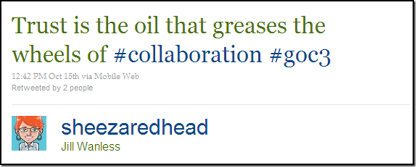
On Jack Bauer and Enforcing Data Governance Policies, Jill Wanless commented:

“Data Governance enforcement is a combination of straightforward and logical activities that when implemented correctly will help you achieve compliance, and ensure the success of your program.  I would emphasize that they ALL (Documentation, Communication, Metrics, Remediation, Refinement) need to be part of your overall program, as doing one or a few without the others will lead to increased risk of failure.

My favorite?  Tough to choose.  The metrics are key, as are the documentation, remediation and refinement.  But to me they all depend upon good communications.  If you don’t communicate your policies, metrics, risks, issues, challenges, work underway, etc., you will fail!  I have seen instances where policies have been established, yet they weren’t followed for the simple fact that people were unaware they existed.”

On Is your data complete and accurate, but useless to your business?, Dylan Jones commented:

“This sparks an episode I had a few years ago with an engineering services company in the UK.

I ran a management workshop showing a lot of the issues we had uncovered.  As we were walking through a dashboard of all the findings one of the directors shouted out that the 20% completeness stats for a piece of engineering installation data was wrong, she had received no reports of missing data.

I drilled into the raw data and sure enough we found that 80% of the data was incomplete.

She was furious and demanded that site visits be carried out and engineers should be incentivized (i.e., punished!) in order to maintain this information.

What was interesting is that the data went back many years so I posed the question:

‘Has your decision-making ability been impeded by this lack of information?’

What followed was a lengthy debate, but the outcome was NO, it had little effect on operations or strategic decision making.

The company could have invested considerable amounts of time and money in maintaining this information but the benefits would have been marginal.

One of the most important dimensions to add to any data quality assessment is USEFULNESS, I use that as a weight to reduce the impact of other dimensions.  To extend your debate further, data may be hopelessly inaccurate and incomplete, but if it’s of no use, then let’s take it out of the equation.”

On Is your data complete and accurate, but useless to your business?, Gordon Hamilton commented:

“Data Quality dimensions that track a data set’s significance to the Business such as Relevance or Impact could help keep the care and feeding efforts for each data set in ratio to their importance to the Business.

I think you are suggesting that the Business’s strategic/tactical objectives should be used to self-assess and even prune data quality management efforts, in order to keep them aligned with the Business rather than letting them have an independent life of their own.

I wonder if all business activities could use a self-assessment metric built in to their processing so that they can realign to reality.  In the low levels of biology this is sometimes referred to as a ‘suicide gene’ that lets a cell decide when it is no longer needed.  Suicide is such a strong term though, maybe it could be called an: annual review to realign efforts to organizational goals gene.”

On Is your data complete and accurate, but useless to your business?, Winston Chen commented:

“A particularly nasty problem in data management is that data created for one purpose gets used for another.  Often, the people who use the data don't have a choice.  It’s the only data available!

And when the same piece of data is used for multiple purposes, it gets even tougher.  As you said, completeness and accuracy has a context: the same piece of data could be good for one purpose and useless for another.

A major goal of data governance is to define and enforce policies that aligns how data is created with how data is used.  And if conflicts arise—they surely will—there’s a mechanism for resolving them.”

On Data Quality and the Cupertino Effect, Marty Moseley commented:

“I usually separate those out by saying that validity is a binary measurement of whether or not a value is correct or incorrect within a certain context, whereas accuracy is a measurement of the valid value’s ‘correctness’ within the context of the other data surrounding it and/or the processes operating upon it.

So, validity answers the question: ‘Is ZW a valid country code?’ and the answer would (currently) be ‘Yes, on the African continent, or perhaps on planet Earth.’

Accuracy answers the question: ‘Is it 2.5 degrees Celsius today in Redding, California?’

To which the answer would measure several things: is 2.5 degrees Celsius a valid temperature for Redding, CA? (yes it is), is it probable this time of year? (no, it has never been nearly that cold on this date), and are there any weather anomalies noted that might recommend that 2.5C is valid for Redding today? (no, there are not). So even though 2.5C is a valid air temperature, Redding, CA is a valid city and state combination, and 2.5C is valid for Redding in some parts of the year, that temperature has never been seen in Redding on July 15th and therefore it is probably not accurate.

Another ‘accuracy’ use case is one I’ve run into before: Is it accurate that Customer A purchased $15,049.00 in <product> on order 123 on <this date>?

To answer this, you may look at the average order size for this product (in quantity and overall price), the average order sizes from Customer A (in quantity ordered and monetary value), any promotions that offer such pricing deals, etc.

Given that the normal credit card charges for this customer are in the $50.00 to $150.00 range, and that the products ordered are on average $10.00 to $30.00, and that even the best customers normally do not order more than $200, and that there has never been a single order from this type of customer for this amount, then it is highly unlikely that a purchase of this size is accurate.”

On Do you believe in Magic (Quadrants)?, Len Dubois commented:

“I believe Magic Quadrants (MQ) are a tool that clients of Gartner, and any one else that can get their hands on them, use as one data point in their decision making process.

Analytic reports, like any other data point, are as useful or dangerous as the user wants/needs it to be.  From a buyer’s perspective, a MQ can be used for lots of things:

1. To validate a market
2. To identify vendors in the marketplace
3. To identify minimum qualifications in terms of features and functionality
4. To identify trends
5. To determine a company’s viability
6. To justify one’s choice of a vendor
7. To justify value of a purchase
8. Worse case scenario: defends one choice of a failed selection
9. To demonstrate business value of a technology

I also believe they use the analysts, Ted and Andy in this instance, as a sounding board to validate what they believe or learned from other data points, i.e. references, white papers, demos, friends, colleagues, etc.

In the final analysis though, I know that clients usually make their selection based on many things, the MQ included.  One of the most important decision points is the relationship they have with a vendor or the one they believe they are going to be able to develop with a new vendor—and no MQ is going to tell you that.”

Thank You

Thank you all for your comments.  Your feedback is greatly appreciated—and truly is the best part of my blogging experience.

This entry in the series highlighted commendable comments on OCDQ Blog posts published in May, June, and July of 2010. 

Since there have been so many commendable comments, please don’t be offended if one of your comments wasn’t featured.

Please keep on commenting and stay tuned for future entries in the series.


Related Posts

Commendable Comments (Part 6)

Commendable Comments (Part 5)

Commendable Comments (Part 4)

Commendable Comments (Part 3)

Commendable Comments (Part 2)

Commendable Comments (Part 1)

The Business versus IT—Tear down this wall!

Business Information Technology

This diagram was published in the July 2009 blog post Business Information Technology by Steve Tuck of Datanomic, and was based on a conference conversation with Gwen Thomas of the Data Governance Institute, about the figurative wall, prevalent in most organizations, which literally separates the Business, who usually own its data and understand its use in making critical daily business decisions, from Information Technology (IT), who usually own and maintain the hardware and software infrastructure of its enterprise data architecture.

The success of all enterprise information initiatives requires that this wall be torn down, ending the conflict between the Business and IT, and forging a new collaborative union that Steve and Gwen called Business Information Technology.


Isn’t IT a part of the Business?

In his recent blog post Isn’t IT a Part of “the Business”?, Winston Chen of Kalido examined this common challenge, remarking how “IT is often a cost center playing a supporting role for the frontline functions.  But Finance is a cost center, too.  Is Finance really the Business?  How about Human Resources?  We don’t hear HR people talk about the Business versus HR, do we?”

“Key words are important in setting the tone for communication,” Winston explained.  “When our language suggests IT is not a part of the Business, it cements a damaging us-versus-them mentality.”

“It leads to isolation.  What we need today, more than ever, is close collaboration.”


Purple People

Earlier this year in his blog post “Purple People”: The Key to BI Success, Wayne Eckerson of TDWI used a colorful analogy to discuss this common challenge within the context of business intelligence (BI) programs.

Wayne explained that the color purple is formed by mixing two primary colors: red and blue.  These colors symbolize strong, distinct, and independent perspectives.  Wayne used red to represent IT and blue to represent the Business.

Purple People, according to Wayne, “are key intermediaries who can reconcile the Business and IT and forge a strong and lasting partnership that delivers real value to the organization.”

“Pure technologists or pure business people can’t harness BI successfully.  BI needs Purple People to forge tight partnerships between business people and technologists and harness information for business gain.”

I agree with Wayne, but I believe all enterprise information initiatives, and not just BI, need Purple People for success.


Tearing down the Business-IT Wall

My overly dramatic blog post title is obviously a reference to the famous speech by United States President Ronald Reagan at the Berlin Wall on June 12, 1987.  For more than 25 years, the Berlin Wall had stood as a symbol of not only a divided Germany and divided political ideologies, but more importantly, it was both a figurative and literal symbol of a deeper human divide.

Although Reagan’s speech was merely symbolic of the numerous and complex factors that eventually lead to the dismantling of the Berlin Wall and the end of the Cold War, symbolism is a powerful aspect of human culture—including corporate culture.

The Business-IT Wall is only a figurative wall, but it literally separates the Business and IT in most organizations today.

So much has been written about the need for Business-IT Collaboration on successful enterprise information initiatives that the message is often ignored because people are sick and tired of hearing about it.

However, although there are other barriers to success, and people, process, and technology are all important, by far the most important factor for true and lasting success to be possible is—peoplecollaborating.

Organizations must remove all symbolic obstacles, both figurative and literal, which contribute to the human divide preventing enterprise-wide collaboration within their unique corporate culture.

As for the Business-IT Wall, and all other similar barriers to our collaboration and success, the time is long overdue for us to:

Tear down this wall!

Related Posts

The Road of Collaboration

Finding Data Quality

Data Transcendentalism

Declaration of Data Governance

Podcast: Business Technology and Human-Speak

Not So Strange Case of Dr. Technology and Mr. Business

Data Quality is People!

You're So Vain, You Probably Think Data Quality Is About You

Delivering Data Happiness

Recently, a happiness meme has been making its way around the data quality blogosphere.

Its origins have been traced to a lovely day in Denmark when Henrik Liliendahl Sørensen, with help from The Muppet Show, asked “Why do you watch it?” referring to the typically negative spin in the data quality blogosphere, where it seems we are:

“Always describing how bad data is everywhere.

Bashing executives who don’t get it.

Telling about all the hard obstacles ahead. Explaining you don’t have to boil the ocean but might get success by settling for warming up a nice little drop of water.

Despite really wanting to tell a lot of success stories, being the funny Fozzie Bear on the stage, well, I am afraid I also have been spending most of my time on the balcony with Statler and Waldorf.

So, from this day forward: More success stories.”

In his recent blog posts, The Ugly Duckling and Data Quality Tools: The Cygnets in Information Quality, Henrik has been sharing more success stories, or to phrase it in an even happier way: delivering data happiness.


Delivering Data Happiness

I am reading the great book Delivering Happiness: A Path to Profits, Passion, and Purpose by Tony Hsieh, the CEO of Zappos.

Obviously, the book’s title inspired the title of this blog post. 

One of the Zappos core values is “build a positive team and family spirit,” and I have been thinking about how that applies to data quality improvements, which are often pursued as one of the many aspects of a data governance program.

Most data governance maturity models describe an organization’s evolution through a series of stages intended to measure its capability and maturity, tendency toward being reactive or proactive, and inclination to be project-oriented or program-oriented.

Most data governance programs are started by organizations that are confronted with a painfully obvious need for improvement.

The primary reason that the change management efforts of data governance are resisted is because they rely almost exclusively on negative methods—they emphasize broken business and technical processes, as well as bad data-related employee behaviors.

Although these problems exist and are the root cause of some of the organization’s failures, there are also unheralded processes and employees that prevented other problems from happening, which are the root cause of some of the organization’s successes.

“The best team members,” writes Hsieh while explaining the Zappos core values, “take initiative when they notice issues so that the team and the company can succeed.” 

“The best team members take ownership of issues and collaborate with other team members whenever challenges arise.” 

“The best team members have a positive influence on one another and everyone they encounter.  They strive to eliminate any kind of cynicism and negative interactions.”

The change management efforts of data governance and other enterprise information initiatives often make it sound like no such employees (i.e., “best team members”) currently exist anywhere within an organization. 

The blogosphere, as well as critically acclaimed books and expert presentations at major industry conferences, often seem to be in unanimous and unambiguous agreement in the message that they are broadcasting:

“Everything your organization is currently doing regarding data management is totally wrong!”

Sadly, that isn’t much of an exaggeration.  But I am not trying to accuse anyone of using Machiavellian sales tactics to sell solutions to non-existent problems—poor data quality and data governance maturity are costly realities for many organizations.

Nor am I trying to oversimplify the many real complexities involved when implementing enterprise information initiatives.

However, most of these initiatives focus exclusively on developing new solutions and best practices, failing to even acknowledge the possible presence of existing solutions and best practices.

The success of all enterprise information initiatives requires the kind of enterprise-wide collaboration that is facilitated by the “best team members.”  But where, exactly, do the best team members come from?  Should it really be surprising whenever an enterprise information initiative can’t find any using exclusively negative methods, focusing only on what is currently wrong?

As Gordon Hamilton commented on my previous post, we need to be “helping people rise to the level of the positive expectations, rather than our being codependent in their sinking to the level of the negative expectations.”

We really need to start using more positive methods for fostering change.

Let’s begin by first acknowledging the best team members who are currently delivering data happiness to our organizations.


Related Posts

Why isn’t our data quality worse?

The Road of Collaboration

Common Change

Finding Data Quality

Declaration of Data Governance

The Balancing Act of Awareness

Podcast: Business Technology and Human-Speak

“I can make glass tubes”

“Some is not a number and soon is not a time”

In a true story that I recently read in the book Switch: How to Change Things When Change Is Hard by Chip and Dan Heath, back in 2004, Donald Berwick, a doctor and the CEO of the Institute for Healthcare Improvement, had some ideas about how to reduce the defect rate in healthcare, which, unlike the vast majority of data defects, was resulting in unnecessary patient deaths.

One common defect was deaths caused by medication mistakes, such as post-surgical patients failing to receive their antibiotics in the specified time, and another common defect was mismanaging patients on ventilators, resulting in death from pneumonia.

Although Berwick initially laid out a great plan for taking action, which proposed very specific process improvements, and was supported by essentially indisputable research, few changes were actually being implemented.  After all, his small, not-for-profit organization had only 75 employees, and had no ability whatsoever to force any changes on the healthcare industry.

So, what did Berwick do?  On December 14, 2004, in a speech that he delivered to a room full of hospital administrators at a major healthcare industry conference, he declared:

“Here is what I think we should do.  I think we should save 100,000 lives.

And I think we should do that by June 14, 2006—18 months from today.

Some is not a number and soon is not a time.

Here’s the number: 100,000.

Here’s the time: June 14, 2006—9 a.m.”

The crowd was astonished.  The goal was daunting.  Of course, all the hospital administrators agreed with the goal to save lives, but for a hospital to reduce its defect rate, it has to first acknowledge having a defect rate.  In other words, it has to admit that some patients are dying needless deaths.  And, of course, the hospital lawyers are not keen to put this admission on the record.


Data Denial

Whenever an organization’s data quality problems are discussed, it is very common to encounter data denial.  Most often, this is a natural self-defense mechanism for the people responsible for business processes, technology, and data—and understandable because of the simple fact that nobody likes to be blamed (or feel blamed) for causing or failing to fix the data quality problems.

But data denial can also doom a data quality improvement initiative from the very beginning.  Of course, everyone will agree that ensuring high quality data is being used to make critical daily business decisions is vitally important to corporate success, but for an organization to reduce its data defects, it has to first acknowledge having data defects.

In other words, the organization has to admit that some business decisions are mistakes being made based on poor quality data.


Half Measures

In his excellent recent blog post Half Measures, Phil Simon discussed the compromises often made during data quality initiatives, half measures such as “cleaning up some of the data, postponing parts of the data cleanup efforts, and taking a wait and see approach as more issues are unearthed.”

Although, as Phil explained, it is understandable that different individuals and factions within large organizations will have vested interests in taking action, just as others are biased towards maintaining the status quo, “don’t wait for the perfect time to cleanse your data—there isn’t any.  Find a good time and do what you can.”


Remarkable Data Quality

As Seth Godin explained in his remarkable book Purple Cow: Transform Your Business by Being Remarkable, the opposite of remarkable is not bad or mediocre or poorly done.  The opposite of remarkable is very good.

In other words, you must first accept that your organization has data defects, but most important, since some is not a number and soon is not a time, you must set specific data quality goals and specific times when you will meet (or exceed) your goals.

So, what happened with Berwick’s goal?  Eighteen months later, at the exact moment he’d promised to return—June 14, 2006, at 9 a.m.—Berwick took the stage again at the same major healthcare industry conference, and announced the results:

“Hospitals enrolled in the 100,000 Lives Campaign have collectively prevented an estimated 122,300 avoidable deaths and, as importantly, have begun to institutionalize new standards of care that will continue to save lives and improve health outcomes into the future.”

Although improving your organization’s data quality—unlike reducing defect rates in healthcare—isn’t a matter of life and death, remarkable data quality is becoming a matter of corporate survival in today’s highly competitive and rapidly evolving world.

Perfect data quality is impossible—but remarkable data quality is not.  Be remarkable.

The Real Data Value is Business Insight

Data Values for COUNTRY Understanding your data usage is essential to improving its quality, and therefore, you must perform data analysis on a regular basis.

A data profiling tool can help you by automating some of the grunt work needed to begin your data analysis, such as generating levels of statistical summaries supported by drill-down details, including data value frequency distributions (like the ones shown to the left).

However, a common mistake is to hyper-focus on the data values.

Narrowing your focus to the values of individual fields is a mistake when it causes you to lose sight of the wider context of the data, which can cause other errors like mistaking validity for accuracy.

Understanding data usage is about analyzing its most important context—how your data is being used to make business decisions.


“Begin with the decision in mind”

In his excellent recent blog post It’s time to industrialize analytics, James Taylor wrote that “organizations need to be much more focused on directing analysts towards business problems.”  Although Taylor was writing about how, in advanced analytics (e.g., data mining, predictive analytics), “there is a tendency to let analysts explore the data, see what can be discovered,” I think this tendency is applicable to all data analysis, including less advanced analytics like data profiling and data quality assessments.

Please don’t misunderstand—Taylor and I are not saying that there is no value in data exploration, because, without question, it can definitely lead to meaningful discoveries.  And I continue to advocate that the goal of data profiling is not to find answers, but instead, to discover the right questions.

However, as Taylor explained, it is because “the only results that matter are business results” that data analysis should always “begin with the decision in mind.  Find the decisions that are going to make a difference to business results—to the metrics that drive the organization.  Then ask the analysts to look into those decisions and see what they might be able to predict that would help make better decisions.”

Once again, although Taylor is discussing predictive analytics, this cogent advice should guide all of your data analysis.


The Real Data Value is Business Insight

The Real Data Value is Business Insight

Returning to data quality assessments, which create and monitor metrics based on summary statistics provided by data profiling tools (like the ones shown in the mockup to the left), elevating what are low-level technical metrics up to the level of business relevance will often establish their correlation with business performance, but will not establish metrics that drive—or should drive—the organization.

Although built from the bottom-up by using, for the most part, the data value frequency distributions, these metrics lose sight of the top-down fact that business insight is where the real data value lies.

However, data quality metrics such as completeness, validity, accuracy, and uniqueness, which are just a few common examples, should definitely be created and monitored—unfortunately, a single straightforward metric called Business Insight doesn’t exist.

But let’s pretend that my other mockup metrics were real—50% of the data is inaccurate and there is an 11% duplicate rate.

Oh, no!  The organization must be teetering on the edge of oblivion, right?  Well, 50% accuracy does sound really bad, basically like your data’s accuracy is no better than flipping a coin.  However, which data is inaccurate, and far more important, is the inaccurate data actually being used to make a business decision?

As for the duplicate rate, I am often surprised by the visceral reaction it can trigger, such as: “how can we possibly claim to truly understand who our most valuable customers are if we have an 11% duplicate rate?”

So, would reducing your duplicate rate to only 1% automatically result in better customer insight?  Or would it simply mean that the data matching criteria was too conservative (e.g., requiring an exact match on all “critical” data fields), preventing you from discovering how many duplicate customers you have?  (Or maybe the 11% indicates the matching criteria was too aggressive).

My point is that accuracy and duplicate rates are just numbers—what determines if they are a good number or a bad number?

The fundamental question that every data quality metric you create must answer is: How does this provide business insight?

If a data quality (or any other data) metric can not answer this question, then it is meaningless.  Meaningful metrics always represent business insight because they were created by beginning with the business decisions in mind.  Otherwise, your metrics could provide the comforting, but false, impression that all is well, or you could raise red flags that are really red herrings.

Instead of beginning data analysis with the business decisions in mind, many organizations begin with only the data in mind, which results in creating and monitoring data quality metrics that provide little, if any, business insight and decision support.

Although analyzing your data values is important, you must always remember that the real data value is business insight.


Related Posts

The First Law of Data Quality

Adventures in Data Profiling

Data Quality and the Cupertino Effect

Is your data complete and accurate, but useless to your business?

The Idea of Order in Data

You Can’t Always Get the Data You Want

Red Flag or Red Herring? 

DQ-Tip: “There is no point in monitoring data quality…”

Which came first, the Data Quality Tool or the Business Need?

Selling the Business Benefits of Data Quality

Scrum Screwed Up

This was the inaugural cartoon on Implementing Scrum by Michael Vizdos and Tony Clark, which does a great job of illustrating the fable of The Chicken and the Pig used to describe the two types of roles involved in Scrum, which, quite rare for our industry, is not an acronym, but one common approach among many iterative, incremental frameworks for agile software development.

Scrum is also sometimes used as a generic synonym for any agile framework.  Although I’m not an expert, I’ve worked on more than a few agile programs.  And since I am fond of metaphors, I will use the Chicken and the Pig to describe two common ways that scrums of all kinds can easily get screwed up:

  1. All Chicken and No Pig
  2. All Pig and No Chicken

However, let’s first establish a more specific context for agile development using one provided by a recent blog post on the topic.


A Contrarian’s View of Agile BI

In her excellent blog post A Contrarian’s View of Agile BI, Jill Dyché took a somewhat unpopular view of a popular view, which is something that Jill excels at—not simply for the sake of doing it—because she’s always been well-known for telling it like it is.

In preparation for the upcoming TDWI World Conference in San Diego, Jill was pondering the utilization of agile methodologies in business intelligence (aka BI—ah, there’s one of those oh so common industry acronyms straight out of The Acronymicon).

The provocative TDWI conference theme is: “Creating an Agile BI Environment—Delivering Data at the Speed of Thought.”

Now, please don’t misunderstand.  Jill is an advocate for doing agile BI the right way.  And it’s certainly understandable why so many organizations love the idea of agile BI.  Especially when you consider the slower time to value of most other approaches when compared with, following Jill’s rule of thumb, how agile BI would have “either new BI functionality or new data deployed (at least) every 60-90 days.  This approach establishes BI as a program, greater than the sum of its parts.”

“But in my experience,” Jill explained, “if the organization embracing agile BI never had established BI development processes in the first place, agile BI can be a road to nowhere.  In fact, the dirty little secret of agile BI is this: It’s companies that don’t have the discipline to enforce BI development rigor in the first place that hurl themselves toward agile BI.”

“Peek under the covers of an agile BI shop,” Jill continued, “and you’ll often find dozens or even hundreds of repeatable canned BI reports, but nary an advanced analytics capability. You’ll probably discover an IT organization that failed to cultivate solid relationships with business users and is now hiding behind an agile vocabulary to justify its own organizational ADD. It’s lack of accountability, failure to manage a deliberate pipeline, and shifting work priorities packaged up as so much scrum.”

I really love the term Organizational Attention Deficit Disorder, and in spite of myself, I can’t help but render it acronymically as OADD—which should be pronounced as “odd” because the “a” is silent, as in: “Our organization is really quite OADD, isn’t it?”


Scrum Screwed Up: All Chicken and No Pig

Returning to the metaphor of the Scrum roles, the pigs are the people with their bacon in the game performing the actual work, and the chickens are the people to whom the results are being delivered.  Most commonly, the pigs are IT or the technical team, and the chickens are the users or the business team.  But these scrum lines are drawn in the sand, and therefore easily crossed.

Many organizations love the idea of agile BI because they are thinking like chickens and not like pigs.  And the agile life is always easier for the chicken because they are only involved, whereas the pig is committed.

OADD organizations often “hurl themselves toward agile BI” because they’re enamored with the theory, but unrealistic about what the practice truly requires.  They’re all-in when it comes to the planning, but bacon-less when it comes to the execution.

This is one common way that OADD organizations can get Scrum Screwed Up—they are All Chicken and No Pig.


Scrum Screwed Up: All Pig and No Chicken

Closer to the point being made in Jill’s blog post, IT can pretend to be pigs making seemingly impressive progress, but although they’re bringing home the bacon, it lacks any real sizzle because it’s not delivering any real advanced analytics to business users. 

Although they appear to be scrumming, IT is really just screwing around with technology, albeit in an agile manner.  However, what good is “delivering data at the speed of thought” when that data is neither what the business is thinking, nor truly needs?

This is another common way that OADD organizations can get Scrum Screwed Up—they are All Pig and No Chicken.


Scrum is NOT a Silver Bullet

Scrum—and any other agile framework—is not a silver bullet.  However, agile methodologies can work—and not just for BI.

But whether you want to call it Chicken-Pig Collaboration, or Business-IT Collaboration, or Shiny Happy People Holding Hands, a true enterprise-wide collaboration facilitated by a cross-disciplinary team is necessary for any success—agile or otherwise.

Agile frameworks, when implemented properly, help organizations realistically embrace complexity and avoid oversimplification, by leveraging recurring iterations of relatively short duration that always deliver data-driven solutions to business problems. 

Agile frameworks are successful when people take on the challenge united by collaboration, guided by effective methodology, and supported by enabling technology.  Agile frameworks allow the enterprise to follow what works, for as long as it works, and without being afraid to adjust as necessary when circumstances inevitably change.

For more information about Agile BI, follow Jill Dyché and TDWI World Conference in San Diego, August 15-20 via Twitter.

Worthy Data Quality Whitepapers (Part 3)

In my April 2009 blog post Data Quality Whitepapers are Worthless, I called for data quality whitepapers worth reading.

This post is now the third entry in an ongoing series about data quality whitepapers that I have read and can endorse as worthy.


Matching Technology Improves Data Quality

Steve Sarsfield recently published Matching Technology Improves Data Quality, a worthy data quality whitepaper, which is a primer on the elementary principles, basic theories, and strategies of record matching.

This free whitepaper is available for download from Talend (requires registration by providing your full contact information).

The whitepaper describes the nuances of deterministic and probabilistic matching and the algorithms used to identify the relationships among records.  It covers the processes to employ in conjunction with matching technology to transform raw data into powerful information that drives success in enterprise applications, including customer relationship management (CRM), data warehousing, and master data management (MDM).

Steve Sarsfield is the Talend Data Quality Product Marketing Manager, and author of the book The Data Governance Imperative and the popular blog Data Governance and Data Quality Insider.


Whitepaper Excerpts

Excerpts from Matching Technology Improves Data Quality:

  • “Matching plays an important role in achieving a single view of customers, parts, transactions and almost any type of data.”
  • “Since data doesn’t always tell us the relationship between two data elements, matching technology lets us define rules for items that might be related.”
  • “Nearly all experts agree that standardization is absolutely necessary before matching.  The standardization process improves matching results, even when implemented along with very simple matching algorithms.  However, in combination with advanced matching techniques, standardization can improve information quality even more.”
  • “There are two common types of matching technology on the market today, deterministic and probabilistic.”
  • “Deterministic or rules-based matching is where records are compared using fuzzy algorithms.”
  • “Probabilistic matching is where records are compared using statistical analysis and advanced algorithms.”
  • “Data quality solutions often offer both types of matching, since one is not necessarily superior to the other.”
  • “Organizations often evoke a multi-match strategy, where matching is analyzed from various angles.”
  • “Matching is vital to providing data that is fit-for-use in enterprise applications.”
 

Related Posts

Identifying Duplicate Customers

Customer Incognita

To Parse or Not To Parse

The Very True Fear of False Positives

Data Governance and Data Quality

Worthy Data Quality Whitepapers (Part 2)

Worthy Data Quality Whitepapers (Part 1)

Data Quality Whitepapers are Worthless