Data Quality and the OK Plateau

In his book Moonwalking with Einstein: The Art and Science of Remembering, Joshua Foer explained that “when people first learn to use a keyboard, they improve very quickly from sloppy single-finger pecking to careful two-handed typing, until eventually the fingers move so effortlessly across the keys that the whole process becomes unconscious and the fingers seem to take on a mind of their own.”

“At this point,” Foer continued, “most people’s typing skills stop progressing.  They reach a plateau.  If you think about it, it’s a strange phenomenon.  After all, we’ve always been told that practice makes perfect, and many people sit behind a keyboard for at least several hours a day in essence practicing their typing.  Why don’t they just keep getting better and better?”

Foer then recounted research performed in the 1960s by the psychologists Paul Fitts and Michael Posner, which described the three stages that everyone goes through when acquiring a new skill:

  1. Cognitive — During this stage, you intellectualize the task and discover new strategies to accomplish it more proficiently.
  2. Associative — During this stage, you concentrate less, make fewer major errors, and generally become more efficient.
  3. Autonomous — During this stage, you have gotten as good as you need to get, and are basically running on autopilot.

“During that autonomous stage,” Foer explained, “you lose conscious control over what you are doing.  Most of the time that’s a good thing.  Your mind has one less thing to worry about.  In fact, the autonomous stage seems to be one of those handy features that evolution worked out for our benefit.  The less you have to focus on the repetitive tasks of everyday life, the more you can concentrate on the stuff that really matters, the stuff you haven’t seen before.  And so, once we’re just good enough at typing, we move it to the back of our mind’s filing cabinet and stop paying it any attention.”

“You can see this shift take place in fMRI scans of people learning new skills.  As a task becomes automated, parts of the brain involved in conscious reasoning become less active and other parts of the brain take over.  You could call it the OK plateau, the point at which you decide you’re OK with how good you are at something, turn on autopilot, and stop improving.”

“We all reach OK plateaus in most things we do,” Foer concluded.  “We learn how to drive when we’re in our teens and once we’re good enough to avoid tickets and major accidents, we get only incrementally better.  My father has been playing golf for forty years, and he’s still a duffer.  In four decades his handicap hasn’t fallen even a point.  Why?  He reached an OK plateau.”

I believe that data quality improvement initiatives also eventually reach an OK Plateau, a point just short of data perfection, where the diminishing returns of chasing after zero defects gives way to calling data quality as good as it needs to get.

As long as the autopilot is on, accepting data quality is a journey not a destination, preventing data quality from getting worse, and making sure best practices don’t stop being practiced, then I’m OK with data quality and the OK plateau.  Are you OK?


Related Posts

The Dichotomy Paradox, Data Quality and Zero Defects

The Asymptote of Data Quality

To Our Data Perfectionists

Data Quality and Miracle Exceptions

Data Quality: Quo Vadimus?

The Seventh Law of Data Quality

Data Quality and The Middle Way

Freudian Data Quality

Predictably Poor Data Quality

Satisficing Data Quality

The Hawthorne Effect, Helter Skelter, and Data Governance

In his book The Half-life of Facts: Why Everything We Know Has an Expiration Date, Samuel Arbesman introduced me to the Hawthorne Effect, which is “when subjects behave differently if they know they are being studied.  The effect was named after what happened in a factory called Hawthorne Works outside Chicago in the 1920s and 1930s.”

“Scientists wished to measure,” Arbesman explained, “the effects of environmental changes on the productivity of workers.  They discovered whatever they did to change the workers’ behaviors — whether they increased the lighting or altered any other aspect of the environment — resulted in increased productivity.  However, as soon as the study was completed, productivity dropped.  The researchers concluded that the observations themselves were affecting productivity and not the experimental changes.”

I couldn’t help but wonder how the Hawthorne Effect could affect a data governance program.  When data governance policies are first defined, and their associated procedures and processes are initially implemented, after a little while, and usually after a little resistance, productivity often increases and the organization begins to advance its data governance maturity level.

Perhaps during these early stages employees are well-aware that they’re being observed to make sure they’re complying with the new data governance policies, and this observation itself accounts for advancing to the next maturity level.  Especially since after progress stops being studied so closely, it’s not uncommon for an organization to backslide to an earlier maturity level.

You might be tempted to conclude that continuous monitoring, especially of the Orwellian Big Brother variety, might be able to prevent this from happening, but I doubt it.  Data governance maturity is often misperceived in the same way that expertise is misperceived — as a static state that once achieved signifies a comforting conclusion to all the grueling effort that was required, either to become an expert, or reach a particular data governance maturity level.

However, just like the five stages of data quality, oscillating between different levels of data governance maturity, and perhaps even occasionally coming full circle, may be an inevitable part of the ongoing evolution of a data governance program, which can often feel like a top-down/bottom-up amusement park ride of the Beatles “Helter Skelter” variety:

When you get to the bottom, you go back to the top, where you stop and you turn, and you go for a ride until you get to the bottom — and then you do it again.

Come On Tell Me Your Answers

Do you, don’t you . . . think the Hawthorne Effect affects data governance?

Do you, don’t you . . . think data governance is Helter Skelter?

Tell me, tell me, come on tell me your answers — by posting a comment below.

MDM, Assets, Locations, and the TARDIS

Henrik Liliendahl Sørensen, as usual, is facilitating excellent discussion around master data management (MDM) concepts via his blog.  Two of his recent posts, Multi-Entity MDM vs. Multi-Domain MDM and The Real Estate Domain, have both received great commentary.  So, in case you missed them, be sure to read those posts, and join in their comment discussions/debates.

A few of the concepts discussed and debated reminded me of the OCDQ Radio episode Demystifying Master Data Management, during which guest John Owens explained the three types of data (Transaction, Domain, Master), the four master data entities (Party, Product, Location, Asset), as well as, and perhaps the most important concept of all, the Party-Role Relationship, which is where we find many of the terms commonly used to describe the Party master data entity (e.g., Customer, Supplier, Employee).

Henrik’s second post touched on Location and Asset, which come up far less often in MDM discussions than Party and Product do, and arguably with understandably good reason.  This reminded me of the science fiction metaphor I used during my podcast with John, a metaphor I made in an attempt to help explain the difference and relationship between an Asset and a Location.

Location is often over-identified with postal address, which is actually just one means of referring to a location.  A location can also be referred to by its geographic coordinates, either absolute (e.g., latitude and longitude) or relative (e.g., 7 miles northeast of the intersection of Route 66 and Route 54).

Asset refers to a resource owned or controlled by an enterprise and capable of producing business value.  Assets are often over-identified with their location, especially real estate assets such as a manufacturing plant or an office building, since they are essentially immovable assets always at a particular location.

However, many assets are movable, such as the equipment used to manufacture products, or the technology used to support employee activities.  These assets are not always at a particular location (e.g., laptops and smartphones used by employees) and can also be dependent on other, non-co-located, sub-assets (e.g., replacement parts needed to repair broken equipment).

In Doctor Who, a brilliant British science fiction television program celebrating its 50th anniversary this year, the TARDIS, which stands for Time and Relative Dimension in Space, is the time machine and spaceship the Doctor and his companions travel in.

The TARDIS is arguably the Doctor’s most important asset, but its location changes frequently, both during and across episodes.

So, in MDM, we could say that Location is a time and relative dimension in space where we would currently find an Asset.


Related Posts

OCDQ Radio - Demystifying Master Data Management

OCDQ Radio - Master Data Management in Practice

OCDQ Radio - The Art of Data Matching

Plato’s Data

Once Upon a Time in the Data

The Data Cold War

DQ-BE: Single Version of the Time

The Data Outhouse

Fantasy League Data Quality

OCDQ Radio - The Blue Box of Information Quality

Choosing Your First Master Data Domain

Lycanthropy, Silver Bullets, and Master Data Management

Voyage of the Golden Records

The Quest for the Golden Copy

How Social can MDM get?

Will Social MDM be the New Spam?

More Thoughts about Social MDM

Is Social MDM going the Wrong Way?

The Semantic Future of MDM

Small Data and VRM

Data Quality and Anton’s Syndrome

In his book Incognito: The Secret Lives of the Brain, David Eagleman discussed aspects of a bizarre, and rare, brain disorder called Anton’s Syndrome in which a stroke renders a person blind — but the person denies their blindness.

“Those with Anton’s Syndrome truly believe they are not blind,” Eagleman explained.  “It is only after bumping into enough furniture and walls that they begin to feel that something is amiss.  They are experiencing what they take to be vision, but it is all internally generated.  The external data is not getting to the right places because of the stroke, and so their reality is simply that which is generated by the brain, with little attachment to the real world.  In this sense, what they experience is no different from dreaming, drug trips, or hallucinations.”

Data quality practitioners often complain that business leaders are blind to the importance of data quality to business success, or that they deny data quality issues exist in their organization.  As much as we wish it wasn’t so, often it isn’t until business leaders bump into enough of the negative effects of poor data quality that they begin to feel that something is amiss.  However, as much as we would like to, we can’t really attribute their denial to drug-induced hallucinations.

Sometimes an illusion-of-quality effect is caused when data is excessively filtered and cleansed before it reaches business leaders, perhaps as the result of a perception filter for data quality issues created as a natural self-defense mechanism by the people responsible for the business processes and technology surrounding data, since no one wants to be blamed for causing, or failing to fix, data quality issues.  Unfortunately, this might really leave the organization’s data with little attachment to the real world.

In fairness, sometimes it’s also the blind leading the blind because data quality practitioners often suffer from business blindness by presenting data quality issues without providing business context, without relating data quality metrics in a tangible manner to how the business uses data to support a business process, accomplish a business objective, or make a business decision.

A lot of the disconnect between business leaders, who believe they are not blind to data quality, and data quality practitioners, who believe they are not blind to business context, comes from a crisis of perception.  Each side in this debate believes they have a complete vision, but it’s only after bumping into each other enough times that they begin to envision the organizational blindness caused when data quality is not properly measured within a business context and continually monitored.


Related Posts

Data Quality and Chicken Little Syndrome

Data Quality and Miracle Exceptions

Data Quality: Quo Vadimus?

Availability Bias and Data Quality Improvement

Finding Data Quality

“Some is not a number and soon is not a time”

The Data Quality of Dorian Gray

The Data Quality Wager

DQ-View: The Five Stages of Data Quality

Data Quality and the Bystander Effect

Data Quality and the Q Test

Why isn’t our data quality worse?

The Illusion-of-Quality Effect

Perception Filters and Data Quality

WYSIWYG and WYSIATI

Predictably Poor Data Quality

Data Psychedelicatessen

Data Geeks and Business Blindness

The Real Data Value is Business Insight

Is your data accurate, but useless to your business?

Data Quality Measurement Matters

Data Myopia and Business Relativity

Data and its Relationships with Quality

Plato’s Data

A Tale of Two Datas

Is big data more than just lots and lots of data?  Is big data unstructured and not-so-big data structured?  Malcolm Chisholm explored these questions in his recent Information Management column, where he posited that there are, in fact, two datas.

“One type of data,” Chisholm explained,  “represents non-material entities in vast computerized ecosystems that humans create and manage.  The other data consists of observations of events, which may concern material or non-material entities.”

Providing an example of the first type, Chisholm explained, “my bank account is not a physical thing at all; it is essentially an agreed upon idea between myself, the bank, the legal system, and the regulatory authorities.  It only exists insofar as it is represented, and it is represented in data.  The balance in my bank account is not some estimate with a positive and negative tolerance; it is exact.  The non-material entities of the financial sector are orderly human constructs.  Because they are orderly, we can more easily manage them in computerized environments.”

The orderly human constructs that are represented in data, in the stories told by data (including the stories data tell about us and the stories we tell data) is one of my favorite topics.  In our increasingly data-constructed world, it’s important to occasionally remind ourselves that data and the real world are not the same thing, especially when data represents non-material entities since, with the possible exception of Makers using 3-D printers, data-represented entities do not re-materialize into the real world.

Describing the second type, Chisholm explained, “a measurement is usually a comparison of a characteristic using some criteria, a count of certain instances, or the comparison of two characteristics.  A measurement can generally be quantified, although sometimes it’s expressed in a qualitative manner.  I think that big data goes beyond mere measurement, to observations.”

Chisholm called the first type the Data of Representation, and the second type the Data of Observation.

The data of representation tends to be structured, in the relational sense, but doesn’t need to be (e.g., graph databases) and the data of observation tends to be unstructured, but it can also be structured (e.g., the structured observations generated by either a data profiling tool analyzing structured relational tables or flat files, or a word-counting algorithm analyzing unstructured text).

Structured and unstructured,” Chisholm concluded, “describe form, not essence, and I suggest that representation and observation describe the essences of the two datas.  I would also submit that both datas need different data management approaches.  We have a good idea what these are for the data of representation, but much less so for the data of observation.”

I agree that there are two types of data (i.e., representation and observation, not big and not-so-big) and that different data uses will require different data management approaches.  Although data modeling is still important and data quality still matters, how much data modeling and data quality is needed before data can be effectively used for specific business purposes will vary.

In order to move our discussions forward regarding “big data” and its data management and business intelligence challenges, we have to stop fiercely defending our traditional perspectives about structure and quality in order to effectively manage both the form and essence of the two datas.  We also have to stop fiercely defending our traditional perspectives about data analytics, since there will be some data use cases where depth and detailed analysis may not be necessary to provide business insight.


A Tale of Two Datas

In conclusion, and with apologies to Charles Dickens and his A Tale of Two Cities, I offer the following A Tale of Two Datas:

It was the best of times, it was the worst of times.
It was the age of Structured Data, it was the age of Unstructured Data.
It was the epoch of SQL, it was the epoch of NoSQL.
It was the season of Representation, it was the season of Observation.
It was the spring of Big Data Myth, it was the winter of Big Data Reality.
We had everything before us, we had nothing before us,
We were all going direct to hoarding data, we were all going direct the other way.
In short, the period was so far like the present period, that some of its noisiest authorities insisted on its being signaled, for Big Data or for not-so-big data, in the superlative degree of comparison only.

Related Posts

HoardaBytes and the Big Data Lebowski

The Idea of Order in Data

The Most August Imagination

Song of My Data

The Lies We Tell Data

Our Increasingly Data-Constructed World

Plato’s Data

OCDQ Radio - Demystifying Master Data Management

OCDQ Radio - Data Quality and Big Data

Big Data: Structure and Quality

Swimming in Big Data

Sometimes it’s Okay to be Shallow

Darth Vader, Big Data, and Predictive Analytics

The Big Data Theory

Finding a Needle in a Needle Stack

Exercise Better Data Management

Magic Elephants, Data Psychics, and Invisible Gorillas

Why Can’t We Predict the Weather?

Data and its Relationships with Quality

A Tale of Two Q’s

A Tale of Two G’s

Exercise Better Data Management

Recently on Twitter, Daragh O Brien and I discussed his proposed concept.  “After Big Data,” Daragh tweeted, “we will inevitably begin to see the rise of MOData as organizations seek to grab larger chunks of data and digest it.  What is MOData?  It’s MO’Data, as in MOre Data. Or Morbidly Obese Data.  Only good data quality and data governance will determine which.”

Daragh asked if MO’Data will be the Big Data Killer.  I said only if MO’Data doesn’t include MO’BusinessInsight, MO’DataQuality, and MO’DataPrivacy (i.e., more business insight, more data quality, and more data privacy).

“But MO’Data is about more than just More Data,” Daragh replied.  “It’s about avoiding Morbidly Obese Data that clogs data insight and data quality, etc.”

I responded that More Data becomes Morbidly Obese Data only if we don’t exercise better data management practices.

Agreeing with that point, Daragh replied, “Bring on MOData and the Pilates of Data Quality and Data Governance.”

To slightly paraphrase lines from one of my favorite movies — Airplane! — the Cloud is getting thicker and the Data is getting laaaaarrrrrger.  Surely I know well that growing data volumes is a serious issue — but don’t call me Shirley.

Whether you choose to measure it in terabytes, petabytes, exabytes, HoardaBytes, or how much reality bites, the truth is we were consuming way more than our recommended daily allowance of data long before the data management industry took a tip from McDonald’s and put the word “big” in front of its signature sandwich.  (Oh great . . . now I’m actually hungry for a Big Mac.)

But nowadays with silos replicating data, as well as new data, and new types of data, being created and stored on a daily basis, our data is resembling the size of Bob Parr in retirement, making it seem like not even Mr. Incredible in his prime possessed the super strength needed to manage all of our data.  Those were references to the movie The Incredibles, where Mr. Incredible was a superhero who, after retiring into civilian life under the alias of Bob Parr, elicits the observation from this superhero costume tailor: “My God, you’ve gotten fat.”  Yes, I admit not even Helen Parr (aka Elastigirl) could stretch that far for a big data joke.

A Healthier Approach to Big Data

Although Daragh’s concerns about morbidly obese data are valid, no superpowers (or other miracle exceptions) are needed to manage all of our data.  In fact, it’s precisely when we are so busy trying to manage all of our data that we hoard countless bytes of data without evaluating data usage, gathering data requirements, or planning for data archival.  It’s like we are trying to lose weight by eating more and exercising less, i.e., consuming more data and exercising less data quality and data governance.  As Daragh said, only good data quality and data governance will determine whether we get more data or morbidly obese data.

Losing weight requires a healthy approach to both diet and exercise.  A healthy approach to diet includes carefully choosing the food you consume and carefully controlling your portion size.  A healthy approach to exercise includes a commitment to exercise on a regular basis at a sufficient intensity level without going overboard by spending several hours a day, every day, at the gym.

Swimming is a great form of exercise, but swimming in big data without having a clear business objective before you jump into the pool is like telling your boss that you didn’t get any work done because you decided to spend all day working out at the gym.

Carefully choosing the data you consume and carefully controlling your data portion size is becoming increasingly important since big data is forcing us to revisit information overload.  However, the main reason that traditional data management practices often become overwhelmed by big data is because traditional data management practices are not always the right approach.

We need to acknowledge that some big data use cases differ considerably from traditional ones.  Data modeling is still important and data quality still matters, but how much data modeling and data quality is needed before big data can be effectively used for business purposes will vary.  In order to move the big data discussion forward, we have to stop fiercely defending our traditional perspectives about structure and quality.  We also have to stop fiercely defending our traditional perspectives about analytics, since there will be some big data use cases where depth and detailed analysis may not be necessary to provide business insight.

Better than Big or More

Jim Ericson explained that your data is big enough.  Rich Murnane explained that bigger isn’t better, better is better.  Although big data may indeed be followed by more data that doesn’t necessarily mean we require more data management in order to prevent more data from becoming morbidly obese data.  I think that we just need to exercise better data management.


Related Posts

Data Myopia and Business Relativity

Since how data quality is defined has a significant impact on how data quality is perceived, measured, and managed, in this post I examine the two most prevalent perspectives on defining data quality, real-world alignment and fitness for the purpose of use, which respectively represent what I refer to as the danger of data myopia and the challenge of business relativity.

Real-World Alignment: The Danger of Data Myopia

Whether it’s an abstract description of real-world entities (i.e., master data) or an abstract description of real-world interactions (i.e., transaction data) among entities, data is an abstract description of reality.  The creation and maintenance of these abstract descriptions shapes the organization’s perception of the real world, which I philosophically pondered in my post Plato’s Data.

The inconvenient truth is that the real world is not the same thing as the digital worlds captured within our databases.

And, of course, creating and maintaining these digital worlds is no easy task, which is exactly the danger inherent with the real-world alignment definition of data quality — when the organization’s data quality efforts are focused on minimizing the digital distance between data and the constantly changing real world that data attempts to describe, it can lead to a hyper-focus on the data in isolation, otherwise known as data myopia.

Even if we create and maintain perfect real-world alignment, what value does high-quality data possess independent of its use?

Real-world alignment reflects the perspective of the data provider, and its advocates argue that providing a trusted source of data to the organization will be able to satisfy any and all business requirements, i.e., high-quality data should be fit to serve as the basis for every possible use.  Therefore, in theory, real-world alignment provides an objective data foundation independent of the subjective uses defined by the organization’s many data consumers.

However, providing the organization with a single system of record, a single version of the truth, a single view, a golden copy, or a consolidated repository of trusted data has long been the rallying cry and siren song of enterprise data warehousing (EDW), and more recently, of master data management (MDM).  Although these initiatives can provide significant business value, it is usually poor data quality that undermines the long-term success and sustainability of EDW and MDM implementations.

Perhaps the enterprise needs a Ulysses pact to protect it from believing in EDW or MDM as a miracle exception for data quality?

A significant challenge for the data provider perspective on data quality is that it is difficult to make a compelling business case on the basis of trusted data without direct connections to the specific business needs of data consumers, whose business, data, and technical requirements are often in conflict with one another.

In other words, real-world alignment does not necessarily guarantee business-world alignment.

So, if using real-world alignment as the definition of data quality has inherent dangers, we might be tempted to conclude that the fitness for the purpose of use definition of data quality is the better choice.  Unfortunately, that is not necessarily the case.

Fitness for the Purpose of Use: The Challenge of Business Relativity

Relativity.jpg

In M. C. Escher’s famous 1953 lithograph Relativity, although we observe multiple, and conflicting, perspectives of reality, from the individual perspective of each person, everything must appear normal, since they are all casually going about their daily activities.

I have always thought this is an apt analogy for the multiple business perspectives on data quality that exists within every organization.

Like truth, beauty, and art, data quality can be said to be in the eyes of the beholder, or when data quality is defined as fitness for the purpose of use — the eyes of the user.

Most data has both multiple uses and users.  Data of sufficient quality for one use or user may not be of sufficient quality for other uses and users.  These multiple, and often conflicting, perspectives are considered irrelevant from the perspective of an individual user, who just needs quality data to support their own business activities.

Therefore, the user (i.e., data consumer) perspective establishes a relative business context for data quality.

Whereas the real-world alignment definition of data quality can cause a data-myopic focus, the business-world alignment goal of the fitness for the purpose of use definition must contend with the daunting challenge of business relativity.  Most data has multiple data consumers, each with their own relative business context for data quality, making it difficult to balance the diverse data needs and divergent data quality perspectives within the conflicting, and rather Escher-like, reality of the organization.

The data consumer perspective on data quality is often the root cause of the data silo problem, the bane of successful enterprise data management prevalent in most organizations, where each data consumer maintains their own data silo, customized to be fit for the purpose of their own use.  Organizational culture and politics also play significant roles since data consumers legitimately fear that losing their data silos would revert the organization to a one-size-fits-all data provider perspective on data quality.

So, clearly the fitness for the purpose of use definition of data quality is not without its own considerable challenges to overcome.

How does your organization define data quality?

As I stated at the beginning of this post, how data quality is defined has a significant impact on how data quality is perceived, measured, and managed.  I have witnessed the data quality efforts of an organization struggle with, and at times fail because of, either the danger of data myopia or the challenge of business relativity — or, more often than not, some combination of both.

Although some would define real-world alignment as data quality and fitness for the purpose of use as information quality, I have found adding the nuance of data versus information only further complicates an organization’s data quality discussions.

But for now, I will just conclude a rather long (sorry about that) post by asking for reader feedback on this perennial debate.

How does your organization define data quality?  Please share your thoughts and experiences by posting a comment below.

Data Quality and Big Data

OCDQ Radio is a vendor-neutral podcast about data quality and its related disciplines, produced and hosted by Jim Harris.

This is Part 2 of 2 from my recent discussion with Tom Redman.  In this episode, Tom and I discuss data quality and big data, including if data quality matters less in larger data sets, if statistical outliers represent business insights or data quality issues, statistical sampling errors versus measurement calibration errors, mistaking signal for noise (i.e., good data for bad data), and whether or not the principles and practices of true “data scientists” will truly be embraced by an organization’s business leaders.

Dr. Thomas C. Redman (the “Data Doc”) is an innovator, advisor, and teacher.  He was first to extend quality principles to data and information in the late 80s.  Since then he has crystallized a body of tools, techniques, roadmaps and organizational insights that help organizations make order-of-magnitude improvements.

More recently Tom has developed keen insights into the nature of data and formulated the first comprehensive approach to “putting data to work.”  Taken together, these enable organizations to treat data as assets of virtually unlimited potential.

Tom has personally helped dozens of leaders and organizations better understand data and data quality and start their data programs.  He is a sought-after lecturer and the author of dozens of papers and four books.  The most recent, Data Driven: Profiting from Your Most Important Business Asset (Harvard Business Press, 2008) was a Library Journal best buy of 2008.

Prior to forming Navesink Consulting Group in 1996, Tom conceived the Data Quality Lab at AT&T Bell Laboratories in 1987 and led it until 1995.  Tom holds a Ph.D. in statistics from Florida State University. He holds two patents.

Popular OCDQ Radio Episodes

Clicking on the link will take you to the episode’s blog post:

  • Demystifying Data Science — Guest Melinda Thielbar, a Ph.D. Statistician, discusses what a data scientist does and provides a straightforward explanation of key concepts such as signal-to-noise ratio, uncertainty, and correlation.
  • Demystifying Master Data Management — Guest John Owens explains the three types of data (Transaction, Domain, Master), the four master data entities (Party, Product, Location, Asset), and the Party-Role Relationship, which is where we find many of the terms commonly used to describe the Party master data entity (e.g., Customer, Supplier, Employee).
  • Data Governance Star Wars — Special Guests Rob Karel and Gwen Thomas joined this extended, and Star Wars themed, discussion about how to balance bureaucracy and business agility during the execution of data governance programs.
  • The Johari Window of Data Quality — Guest Martin Doyle discusses helping people better understand their data and assess its business impacts, not just the negative impacts of bad data quality, but also the positive impacts of good data quality.
  • Studying Data Quality — Guest Gordon Hamilton discusses the key concepts from recommended data quality books, including those which he has implemented in his career as a data quality practitioner.

Data Quality and Miracle Exceptions

“Reading superhero comic books with the benefit of a Ph.D. in physics,” James Kakalios explained in The Physics of Superheroes, “I have found many examples of the correct description and application of physics concepts.  Of course, the use of superpowers themselves involves direct violations of the known laws of physics, requiring a deliberate and willful suspension of disbelief.”

“However, many comics need only a single miracle exception — one extraordinary thing you have to buy into — and the rest that follows as the hero and the villain square off would be consistent with the principles of science.”

“Data Quality is all about . . .”

It is essential to foster a marketplace of ideas about data quality in which a diversity of viewpoints is freely shared without bias, where everyone is invited to get involved in discussions and debates and have an opportunity to hear what others have to offer.

However, one of my biggest pet peeves about the data quality industry is when I listen to analysts, vendors, consultants, and other practitioners discuss data quality challenges, I am often required to make a miracle exception for data quality.  In other words, I am given one extraordinary thing I have to buy into in order to be willing to buy their solution to all of my data quality problems.

These superhero comic book style stories usually open with a miracle exception telling me that “data quality is all about . . .”

Sometimes, the miracle exception is purchasing technology from the right magic quadrant.  Other times, the miracle exception is either following a comprehensive framework, or following the right methodology from the right expert within the right discipline (e.g., data modeling, business process management, information quality management, agile development, data governance, etc.).

But I am especially irritated by individuals who bash vendors for selling allegedly only reactive data cleansing tools, while selling their allegedly only proactive defect prevention methodology, as if we could avoid cleaning up the existing data quality issues, or we could shut down and restart our organizations, so that before another single datum is created or business activity is executed, everyone could learn how to “do things the right way” so that “the data will always be entered right, the first time, every time.”

Although these and other miracle exceptions do correctly describe the application of data quality concepts in isolation, by doing so, they also oversimplify the multifaceted complexity of data quality, requiring a deliberate and willful suspension of disbelief.

Miracle exceptions certainly make for more entertaining stories and more effective sales pitches, but oversimplifying complexity for the purposes of explaining your approach, or, even worse and sadly more common, preaching at people that your approach definitively solves their data quality problems, is nothing less than applying the principle of deus ex machina to data quality.

Data Quality and deus ex machina

Deus ex machina is a plot device whereby a seemingly unsolvable problem is suddenly and abruptly solved with the contrived and unexpected intervention of some new event, character, ability, or object.

This technique is often used in the marketing of data quality software and services, where the problem of poor data quality can seemingly be solved by a new event (e.g., creating a data governance council), a new character (e.g., hiring an expert consultant), a new ability (e.g., aligning data quality metrics with business insight), or a new object (e.g., purchasing a new data quality tool).

Now, don’t get me wrong.  I do believe various technologies and methodologies from numerous disciplines, as well as several core principles (e.g., communication, collaboration, and change management) are all important variables in the data quality equation, but I don’t believe that any particular variable can be taken in isolation and deified as the God Particle of data quality physics.

Data Quality is Not about One Extraordinary Thing

Data quality isn’t all about technology, nor is it all about methodology.  And data quality isn’t all about data cleansing, nor is it all about defect prevention.  Data quality is not about only one thing — no matter how extraordinary any one of its things may seem.

Battling the dark forces of poor data quality doesn’t require any superpowers, but it does require doing the hard daily work of continuously improving your data quality.  Data quality does not have a miracle exception, so please stop believing in one.

And for the love of high-quality data everywhere, please stop trying to sell us one.

Data Quality: Quo Vadimus?

Over the past week, an excellent meme has been making its way around the data quality blogosphere.  It all started, as many of the best data quality blogging memes do, with a post written by Henrik Liliendahl Sørensen.

In Turning a Blind Eye to Data Quality, Henrik blogged about how, as data quality practitioners, we are often amazed by the inconvenient truth that our organizations are capable of growing as a successful business even despite the fact that they often turn a blind eye to data quality by ignoring data quality issues and not following the data quality best practices that we advocate.

“The evidence about how poor data quality is costing enterprises huge sums of money has been out there for a long time,” Henrik explained.  “But business successes are made over and over again despite bad data.  There may be casualties, but the business goals are met anyway.  So, poor data quality is just something that makes the fight harder, not impossible.”

As data quality practitioners, we often don’t effectively sell the business benefits of data quality, but instead we often only talk about the negative aspects of not investing in data quality, which, as Henrik explained, is usually why business leaders turn a blind eye to data quality challenges.  Henrik concluded with the recommendation that when we are talking with business leaders, we need to focus on “smaller, but tangible, wins where data quality improvement and business efficiency goes hand in hand.”


Is Data Quality a Journey or a Destination?

Henrik’s blog post received excellent comments, which included a debate about whether data quality is a journey or a destination.

Garry Ure responded with his blog post Destination Unknown, in which he explained how “historically the quest for data quality was likened to a journey to convey the concept that you need to continue to work in order to maintain quality.”  But Garry also noted that sometimes when an organization does successfully ingrain data quality practices into day-to-day business operations, it can make it seem like data quality is a destination that the organization has finally reached.

Garry concluded data quality is “just one destination of many on a long and somewhat recursive journey.  I think the point is that there is no final destination, instead the journey becomes smoother, quicker, and more pleasant for those traveling.”

Bryan Larkin responded to Garry with the blog post Data Quality: Destinations Known, in which Bryan explained, “data quality should be a series of destinations where short journeys occur on the way to those destinations.  The reason is simple.  If we make it about one big destination or one big journey, we are not aligning our efforts with business goals.”

In order to do this, Bryan recommends that “we must identify specific projects that have tangible business benefits (directly to the bottom line — at least to begin with) that are quickly realized.  This means we are looking at less of a smooth journey and more of a sprint to a destination — to tackle a specific problem and show results in a short amount of time.  Most likely we’ll have a series of these sprints to destinations with little time to enjoy the journey.”

“While comprehensive data quality initiatives,” Bryan concluded, “are things we as practitioners want to see — in fact we build our world view around such — most enterprises (not all, mind you) are less interested in big initiatives and more interested in finite, specific, short projects that show results.  If we can get a series of these lined up, we can think of them more in terms of an overall comprehensive plan if we like — even a journey.  But most functional business staff will think of them in terms of the specific projects that affect them.”

The Latin phrase Quo Vadimus? translates into English as “Where are we going?”  When I ponder where data quality is going, and whether data quality is a journey or a destination, I am reminded of the words of T.S. Eliot:

“We must not cease from exploration and the end of all our exploring will be to arrive where we began and to know the place for the first time.”

We must not cease from exploring new ways to continuously improve our data quality and continuously put into practice our data governance principles, policies, and procedures, and the end of all our exploring will be to arrive where we began and to know, perhaps for the first time, the value of high-quality data to our enterprise’s continuing journey toward business success.

Dot Collectors and Dot Connectors

The attention blindness inherent in the digital age often leads to a debate about multitasking, which many claim impairs our ability to solve complex problems.  Therefore, we often hear that we need to adopt monotasking, i.e., we need to eliminate all possible distractions and focus our attention on only one task at a time.

However, during the recent Harvard Business Review podcast The Myth of Monotasking, Cathy Davidson, author of the new book Now You See It: How the Brain Science of Attention Will Transform the Way We Live, Work, and Learn, explained how “the moment that you start not paying attention fully to the task at hand, you actually start seeing other things that your attention would have missed.”  Although Davidson acknowledges that attention blindness is a serious problem, she explained that there really is no such thing as monotasking.  Modern neuroscience research has revealed that the human brain is, in fact, always multitasking.  Furthermore, she explained how multitasking can be extremely useful for a new and expansive form of attention.

“We all see selectively, but we don’t select the same things to see,” Davidson explained.  “So if we can learn to work together, we can actually account for, and productively work around, our own individual attention blindness by seeing collaboratively in a way that compensates for that blindness.”

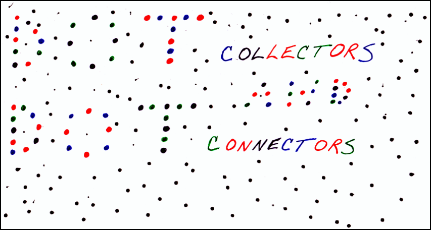
During the podcast, an analogy was made that focusing attention on specific tasks can result in a lot of time spent collecting dots without spending enough time connecting those dots.  This point caused me to ponder the division of organizational labor that has historically existed between the dot collection of data management, which focuses on aspects such as data integrity and data quality, and the dot connection of business intelligence, which focuses on aspects such as data analysis and data visualization.

I think most data management professionals are dot collectors since it often seems like they spend a lot of their time, money, and attention on collecting (and profiling, modeling, cleansing, transforming, matching, and otherwise managing) data dots.

But since data’s value comes from data’s usefulness, merely collecting data dots doesn’t mean anything if you cannot connect those dots into meaningful patterns that enable your organization to take action or otherwise support your business activities.

So I think most business intelligence professionals are dot connectors since it often seems like they spend a lot of their time, money, and attention on connecting (and querying, aggregating, reporting, visualizing, and otherwise analyzing) data dots.

However, the attention blindness of data management and business intelligence professionals means that they see selectively, often intentionally selecting to not see the same things.  But as more of our personal and professional lives become digitized and pixelated, the big picture of the business world is inundated with the multifaceted challenges of big data, where the fast-moving large volumes of varying data are transforming the way we have to view traditional data management and business intelligence.

We need to replace our perspective of data management and business intelligence as separate monotasking activities with an expansive form of organizational multitasking where the dot collectors and dot connectors work together more collaboratively.


Related Posts

Channeling My Inner Beagle: The Case for Hyperactivity

Mind the Gap

The Wisdom of the Social Media Crowd

No Datum is an Island of Serendip

DQ-View: Data Is as Data Does

The Real Data Value is Business Insight

Information Overload Revisited

Neither the I Nor the T is Magic

The Big Data Collider

OCDQ Radio - Big Data and Big Analytics

OCDQ Radio - So Long 2011, and Thanks for All the . . .

The Interconnected User Interface

Redefining Data Quality

OCDQ Radio is a vendor-neutral podcast about data quality and its related disciplines, produced and hosted by Jim Harris.

During this episode, I have an occasionally spirited discussion about data quality with Peter Perera, partially precipitated by his provocative post from this past summer, The End of Data Quality...as we know it, which included his proposed redefinition of data quality, as well as his perspective on the relationship of data quality to master data management and data governance.

Peter Perera is a recognized consultant and thought leader with significant experience in Master Data Management, Customer Relationship Management, Data Quality, and Customer Data Integration.  For over 20 years, he has been advising and working with Global 5000 organizations and mid-size enterprises to increase the usability and value of their customer information.

Popular OCDQ Radio Episodes

Clicking on the link will take you to the episode’s blog post:

  • Demystifying Data Science — Guest Melinda Thielbar, a Ph.D. Statistician, discusses what a data scientist does and provides a straightforward explanation of key concepts such as signal-to-noise ratio, uncertainty, and correlation.
  • Data Quality and Big Data — Guest Tom Redman (aka the “Data Doc”) discusses Data Quality and Big Data, including if data quality matters less in larger data sets, and if statistical outliers represent business insights or data quality issues.
  • Demystifying Master Data Management — Guest John Owens explains the three types of data (Transaction, Domain, Master), the four master data entities (Party, Product, Location, Asset), and the Party-Role Relationship, which is where we find many of the terms commonly used to describe the Party master data entity (e.g., Customer, Supplier, Employee).
  • Data Governance Star Wars — Special Guests Rob Karel and Gwen Thomas joined this extended, and Star Wars themed, discussion about how to balance bureaucracy and business agility during the execution of data governance programs.
  • The Johari Window of Data Quality — Guest Martin Doyle discusses helping people better understand their data and assess its business impacts, not just the negative impacts of bad data quality, but also the positive impacts of good data quality.
  • Studying Data Quality — Guest Gordon Hamilton discusses the key concepts from recommended data quality books, including those which he has implemented in his career as a data quality practitioner.